10 questions you should ask before meeting your web designer.
New year. New website?
There’s something about the start of a new year that inspires people. You have had a break and should be firing on all cylinders to make a go of 2021. A fresh start. Renewed enthusiasm. Goals and resolutions.
That’s why so many businesses think “New year. New website”.
For some, the Christmas break can provide the breathing space needed to take a step back and think about the bigger picture. So for those business owners, marketeers and pioneers out there, we’ve created 10 questions for you to mull over, over a coffee or orange juice.
Use these pointers to help you plan. It will uncover the motivations and intent behind the project, helping you and your team define and achieve your online success.
Let’s get Started …
#1 What is the main purpose of your website?
It could be to simply provide information about your business. It could be about your product, a shop, to get bookings or to sell tickets.
Is the website an essential part of your business? Or is the website a place to provide information on the company, an extension of the brand (microsite), or a side project?
It might not be a business at all … perhaps it’s an event, community or charity you’re looking to raise awareness about. Whatever the reason, it’s important to have clarity on what is the one single main purpose for the website.
#2 What do you want your website to achieve?
This is an extension to the question above because it goes deeper into understanding the ‘why’ over the ‘what’. In doing so, our design team will be in a stronger position to make recommendations.
For instance, the main purpose for your website might be to provide information about the business. But this could be in order to position yourself in the marketplace, establish credibility and trust, or simply help people find the nearest distributor.
#3 What defines success for you?
Would the project be a success if delivered on budget by a certain date? Or do factors such as number of hits, repeat visitors and time spent on the site come into play?
Are you looking for your Google rankings to improve? Your user feedback to be more positive? are you looking for more active users? Do you want your database to grow? Your enquiries to double? Or your sales to increase?
It’s impossible to know whether the project was a success unless you set clear, measurable goals from the beginning. These need to be numbers and dates (so, 10% increased traffic by month three. 25,000 subscribers by the end of year one, that sort of thing).
We have thrown a few ideas at you there and it would be nice to have them all, right? But it’s better to focus on one. It makes design choices and split testing more effective to have one clearly defined objective.
#4 How will potential customers find you?
Bear in mind that although website design and user experience are pivotal to the success indicators listed above, your offsite activity is likely to play a more influential part than the website itself.
For your signups to grow, your enquiries to double and your sales to increase, we need to get people there in the first place. The only way to do that is to signpost people to your website from other sources. People won’t drive past your website (well, unless it’s address is on a building, van or billboard!).
A mix of online and offline marketing activity is essential to drive people TO your website. Even if it’s the BEST WEBSITE EVER, a co-ordinated launch is needed to get the right people talking about it.
Throw in a little amplification, and it can snowball from there. But there’s a reason e-Bay advertise on billboards. There’s a very good reason Google send you stuff in the post.
#5 What’s your budget?
Asking how much a website costs is a little like asking how much a house costs to build. The budget required for your unique project will depend on the options you choose along the way.
So it is important to have a figure in mind that you feel comfortable investing. And it is an investment. Because you should consider the value of your website to your business. Some will see a website as an overhead. An expense. DONT. Your website is an amazing opportunity to connect with your customers and establish long term relationships.
Consider the point above and remember to allocate something in your budget for promoting your website.
#6 If you’re re-designing your website, why are you changing it?
Was it something your last website did to upset you? Perhaps your current website doesn’t seem as attractive as it used to. Or could it be that your business is into new things now? Maybe you’ve just grown apart.
Change is good. Websites change all the time. They should constantly grow and evolve to adapt to things like user behaviour, technology, search engine algorithms and the law. Popular reasons for change include:
• The need to make the website work better on a mobile
• The desire to sell products online
• Making it easier to edit and add new content yourself
Discussing these points not only ensures the new website ticks the boxes but also helps us anticipate things to consider in the future.
#7 Who are your target audience?
How you approach this question will vary depending on whether it’s a new website or a re-design, for a new business or an established one. If it’s new there will be a bit of research required. If it’s established, you’ll have data to work with and existing customers to ask.
But either way that’s just the start. Because there is a difference between knowing your audience and really understanding what type of people they are. It isn’t enough to only know that they are certain types of businesses in certain areas.
Consider the people visiting your site. What are their ages, interests, hobbies, favourite brands? By understanding the type of people using your website, you and your design team can make more informed choices on the design and delivery of content.
#8 What do your target customers want?
Now you have a clear picture about who your audience is, really focus on their needs. What are they looking to do or find on your website?
Thinking about this will help you deliver what your customers want more effectively. You can design your content and navigation around it. The clarity makes designing landing pages incredibly simple.
Don’t assume. If you have existing analytics data, we can use this, alongside surveys, to help figure this out. If it’s a new enterprise then do some research online. Organise a focus group, talk to potential buyers, ask on Facebook and LinkedIn, or we can help you create a survey on Survey Monkey.
Working with our design team, you can sculpt the user flow and experience to suit. You will likely be rewarded for this through sales and search rankings.
#9 Could your website be a campfire?
We bet you’ve never heard that question before!
Think about the community you serve. If your company installs boilers then fab. Business info, check. Boiler service booking functionality, check. But how about we add some useful content about safety or energy advice?
Imagine you sell camping products. Super! Publish a blog, add videos, provide value for free. Your website will thrive from adopting a content-first approach.
Provide the campfire for people to gather around. Build a community and recommend products to an engaged audience.
#10 Which other websites do you admire?
This is a powerful and efficient way to understand your website aspirations from a visual and user experience point of view.
You can take hours to write a design brief, but sometimes a few example visuals with notes really gets us on the same page. If you’re not sure, that’s ok. Often, after a short conversation, our design team can recommend some sites that might be up your street.
Designing a new website should be a creative and satisfying project that you can really enjoy. With Nettl we know how to make the journey straight forward. Call us now for a free, no obligation chat on 01625 300 123
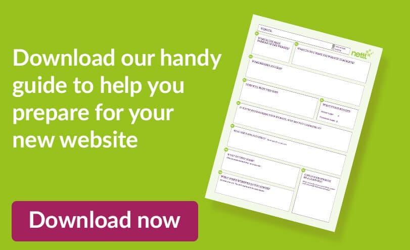
We’ve created a pdf that you can download for free.
You can complete it in acrobat, print it off and fill it in, or just use it as a guide.


